portrait set 3
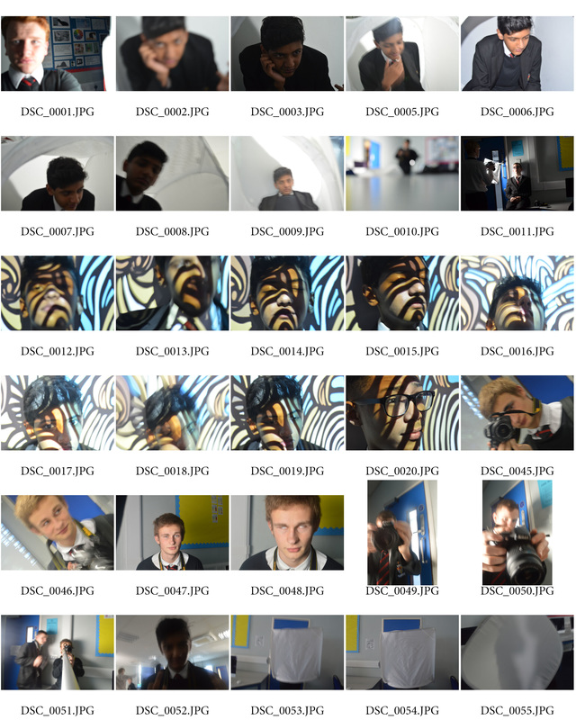
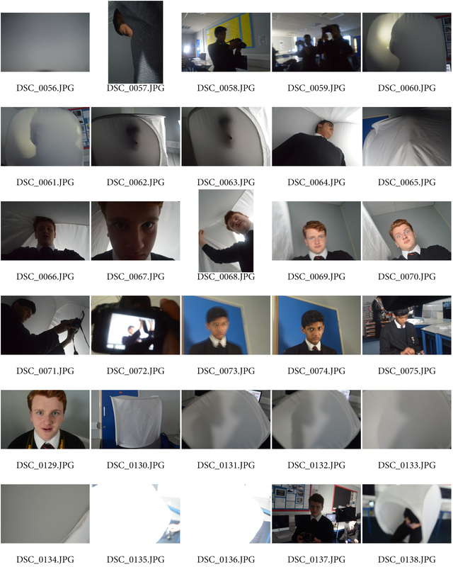
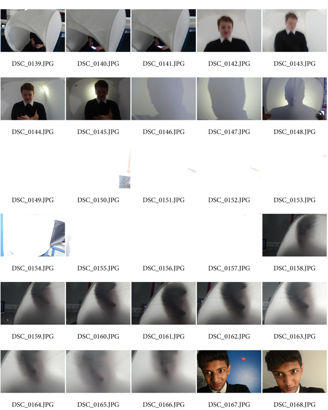
In this set I focused on using light and facial expressions but I also experimented with using the soft box and projecting patterns onto people to show their characteristics. I did this to expand on my initial ideas of using lighting and facial features to show moods and feelings. This was successful because they all show emotions and the lighting changes the mood of the photo completely; the soft box also helped making outlines of people and changing photo moods from calm and happy to eerie. However, not all of them are successful, DSC_0149.jPG to DSC_0157.jPG were really unsuccessful because the studio light made the photos Over-exposure. I'm going to put all these ideas into another set and maybe try more pin hole stuff also experiment more with self portrait stuff like I did in this set and see how that turns out. Also I'm going to try more stuff with the projector to show things like peoples background by showing they nation's flag or their Country's capital city.
|
|
|
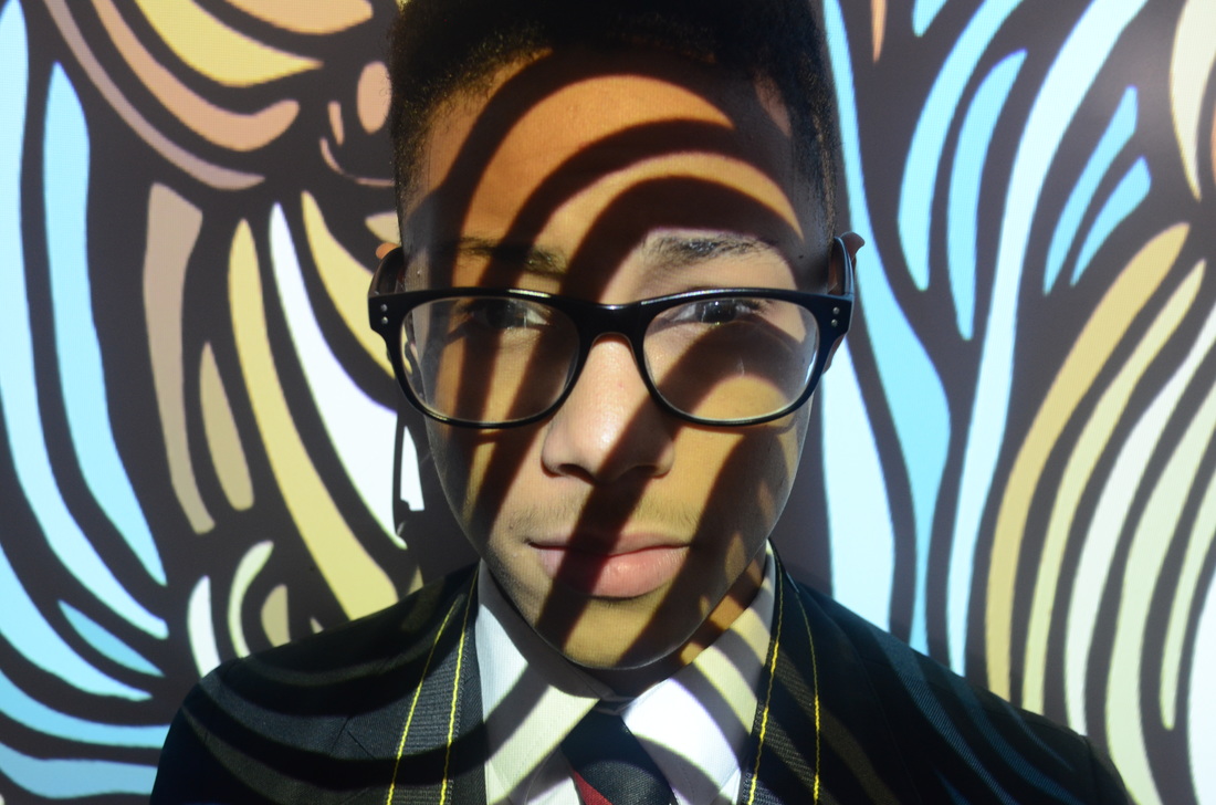
I picked these 3 photos out of all of them because I personally think they're the best ones. The first one is my personal favourite out of the 3 because the photo no negative space in it; all parts of the photo have something going on. Also the composition of the pattern from the projector is really good it doesn't draw attention away from the face which is supposed to be the main bit of the photograph. The textureof this photo is very smooth and isnt really rough in anyparts. It wasn't completely successful though because I wanted a slow progression through the key from low-key up to high-key. Next time I'm going to try different patterns and maybe use their parents national flag to show their heritage. In post processing I'm going to experiment with the colour scheme and see if I can change or alter the colours in the pattern and create a completely different photo.
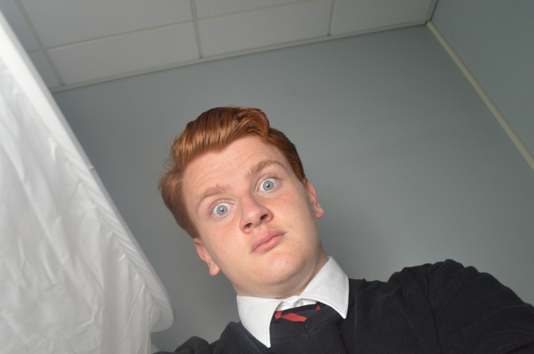
The second photo is a self-portrait of me looking "shocked",I did this to show different emotions and moods so I could have a rough idea of things to do for self portraits and to see if they fit in with all the other photos. I used studio lighs and my phone to take this. There isn't any pattern in this photo or line but the colours that can be seen in the photo are dull apart from the little bit of red from my school tie, aslo the texture that can be seen is really rugged and soft. In addition to this I wanted to show different skills I can do because my portrait part of the project was portraits of only other people this meant that my project was becoming repetitive. There isn't anything unsuccessful in this photo because it was just a trial of self portraits but in the future I'm going to try different lighting effects and moods aslo remove any objects that are around me. Adding on to that, in the future I'm going to do a set of self portraits with myself and maybe other people in them . Furthermore, during post processing I may crop out the soft box and mess around with what colors come out and the hue/saturation.
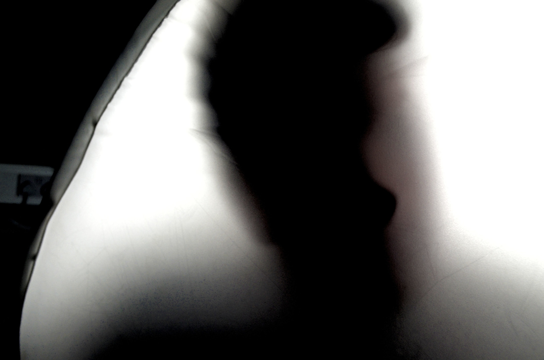
The third photo is a close 2nd of my favorite. The photo is very eerie in itself but with the lighting showing the outline of the person adds to the mood. I made this mood by making someone press their face into the wall of the soft box and putting the studio light behind it without any cover on it so it could make the shadow and outline of the person stand out more. This photo was really successful because it shows how I can manipulate the lighing and things I have around me to make the mood of the photo how I want it also it fits in with what I'm doing in the sets which is showing emotions with lighing and facial features despite the fact teir face is covered up. However it wasn't completely successful because in top left side the background is exposed and I wanted the whole frame to be take up, One way I can prevent this from happening again is to take the photo a few times or crop it out during post-processing. Carrying on from my last point , during post-processing I will make the shadow on the soft box wall darker so instead of having it being high-key photo it will be low-key and even more eerie.
The second photo is a self-portrait of me looking "shocked",I did this to show different emotions and moods so I could have a rough idea of things to do for self portraits and to see if they fit in with all the other photos. I used studio lighs and my phone to take this. There isn't any pattern in this photo or line but the colours that can be seen in the photo are dull apart from the little bit of red from my school tie, aslo the texture that can be seen is really rugged and soft. In addition to this I wanted to show different skills I can do because my portrait part of the project was portraits of only other people this meant that my project was becoming repetitive. There isn't anything unsuccessful in this photo because it was just a trial of self portraits but in the future I'm going to try different lighting effects and moods aslo remove any objects that are around me. Adding on to that, in the future I'm going to do a set of self portraits with myself and maybe other people in them . Furthermore, during post processing I may crop out the soft box and mess around with what colors come out and the hue/saturation.
The third photo is a close 2nd of my favorite. The photo is very eerie in itself but with the lighting showing the outline of the person adds to the mood. I made this mood by making someone press their face into the wall of the soft box and putting the studio light behind it without any cover on it so it could make the shadow and outline of the person stand out more. This photo was really successful because it shows how I can manipulate the lighing and things I have around me to make the mood of the photo how I want it also it fits in with what I'm doing in the sets which is showing emotions with lighing and facial features despite the fact teir face is covered up. However it wasn't completely successful because in top left side the background is exposed and I wanted the whole frame to be take up, One way I can prevent this from happening again is to take the photo a few times or crop it out during post-processing. Carrying on from my last point , during post-processing I will make the shadow on the soft box wall darker so instead of having it being high-key photo it will be low-key and even more eerie.
Photoshop photos
|

|
I picked these two photos to post-process because I was able to change lots of things in them unlike the other photos. Both of these were successful because I did what I said I would do to them and it turned out really well.
In the first Photo I started off by changing the Brightness/contrast of the photo to suit the mood better and to amke it darker, then I altered the "curves" which changes the darkness or lightness of the photo, this meant that all the dark parts of the photo were now extremly dark and all the lighter part were brighter. I aslo changed the exporsue and vibrance to show a tonal change despite it being from a really dark to a dark grey and finally to white. This was successful because everything that I brainstormed during the other paragraph worked out really well and made the photo better. Also post-processing made this photo more eerie which I had in mind while photoshopping it. However, the unsuccessful thing about this is trying to crop out the negative space seemed too difficult do without taking out some of the positive space aswell. I could improve this photo in photoshop by maybe trying to inject more color into it by messing around with the hue/saturation.
In the first Photo I started off by changing the Brightness/contrast of the photo to suit the mood better and to amke it darker, then I altered the "curves" which changes the darkness or lightness of the photo, this meant that all the dark parts of the photo were now extremly dark and all the lighter part were brighter. I aslo changed the exporsue and vibrance to show a tonal change despite it being from a really dark to a dark grey and finally to white. This was successful because everything that I brainstormed during the other paragraph worked out really well and made the photo better. Also post-processing made this photo more eerie which I had in mind while photoshopping it. However, the unsuccessful thing about this is trying to crop out the negative space seemed too difficult do without taking out some of the positive space aswell. I could improve this photo in photoshop by maybe trying to inject more color into it by messing around with the hue/saturation.
